
Cool vs. Warm Colors: Mastering Mood, Style & Space
Colour isn’t just paint—it’s emotion, atmosphere, and design in one. Knowing how cool and warm colors work (especially in wallpapers!) lets you craft the perfect vibe for each room.

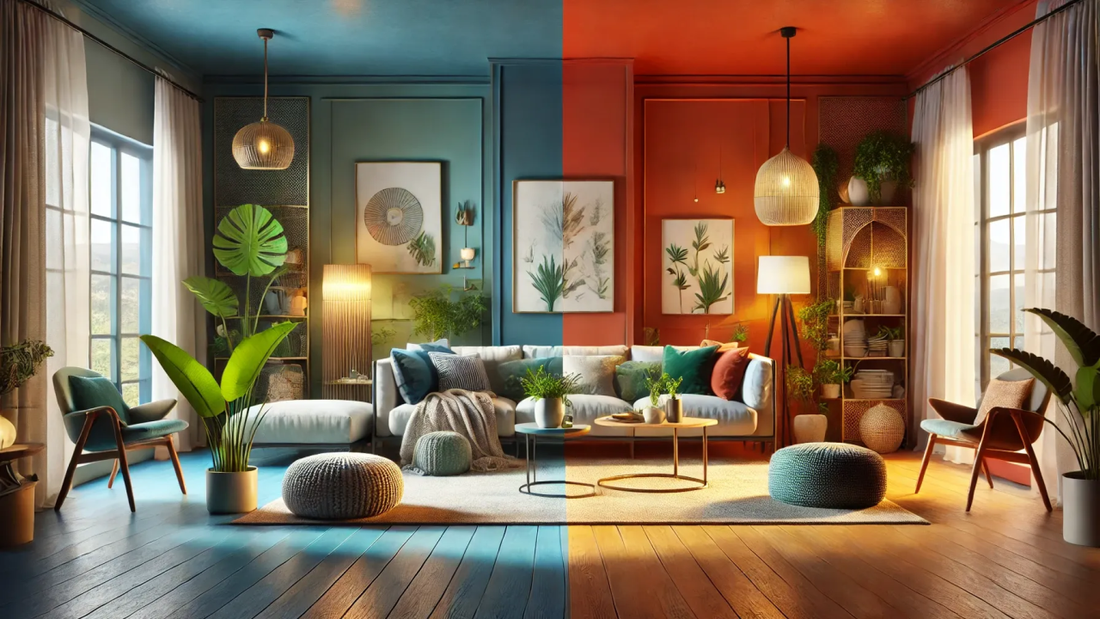
Cool Colors: Calm, Crisp & Spacious
Cool tones include blues, greens, and purples—think ocean, foliage, and twilight
Effects & uses:
- Visually recede to open up small spaces
- Evoke serenity—ideal for bedrooms, baths, yoga and study spaces
- Make warm accents pop—place orange or red décor against cool backgrounds for dramatic contrast
Warm Colors: Cozy, Energetic & Intimate
Warm hues include reds, oranges, yellows, and browns—invoking sunlight, fire, and autumn tones
Why use them:
- "Advance" visually—great for creating focus or smaller, snug spaces
- Infuse energy and sociability—perfect for kitchens, living rooms, dining areas
- Create standout feature walls with bold warm wallpaper or accents
Mixing Cool & Warm: Balance with Impact
You don’t need to choose one—combining them adds richness and depth
Smart strategies:
- Undertone alignment: Ensure both main color and accents share warm or cool undertones
-
60/30/10 rule:
- 60% base cool tone (walls)
- 30% neutral tone (furniture, flooring)
- 10% warm accent (art, pillows)

Takeaway
Colour isn’t just decoration—it influences emotion, perception, and space. By mastering warm and cool tones—and how they contrast and complement—you turn ordinary rooms into expressive, designer-quality environments. Let your wallpaper play the lead… with colors that speak the language of space and mood.